Does the term spread predict a US recession?
Many commentators suggest that a negative term spread (inverted yield curve) in the US may signal an imminent recession, but other data is more positive. In this post, I use an R program jointly with the FRED data base to shed some light on the risk of a US recession.
To show this, let us first look at some simulated data. I simulated 1,000 observations for three persistent time series:
Spurious correlation and a test for leading indicators
Before we delve into data analysis, I want to emphasize a problem when eye-balling lead-lag relationships between GDP growth and potential leading indicators. If two time-series are persistent, meaning that they exhibit long-lasting cycles, we may wrongly conclude that one leads the other. In fact, if two time-series are persistent, we will likely find spurious correlation between the two when in fact there is no relationship.To show this, let us first look at some simulated data. I simulated 1,000 observations for three persistent time series:
y(t) = 0.8y(t-1)+0.1x(t-1)+0.3e(t)
x(t) = 0.9x(t-1)+0.3v(t)
z(t) = 0.9z(t-1)+0.3n(t)
e(t), v(t), n(t) ~ i.i.d. N(0,1)
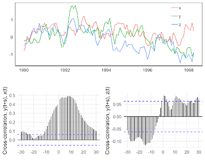
By construction, x is a leading indicator for y, but z is independent of y and x. Figure 1 shows an excerpt of the three time-series and the cross-correlation with y at various leads and lags. When just looking at the data, we are prone to find some lead-lag relationship between the three series. At least in the first part, all three seem to be positively correlated. When looking at the cross-correlation function, x seems to lead y. Note that the blue dashed lines give confidence intervals. Values outside of these intervals indicate that the cross-correlations are statistically significantly different from zero. However, we also find positive cross-correlations for s<0, implying that y leads x. The cross-correlation function with z is even more misleading. We may conclude that z is a counter-cyclical leading indicator, meaning the cross-correlation is negative, with a lead of 10 to 30 periods. But we know that the two variables are independent by construction.
To avoid this spurious correlation problem, Neusser (2016), proposes to “pre-whiten” the data before calculating the cross-correlation function. This means that we fit a time-series model to the data and compute the cross-correlation with the residuals, which are by construction not persistent. So we are less likely to find spurious cross-correlation between the variables.
Indeed, when looking at the cross-correlation between y and z using the pre-whitened data, we do not see any clear lead-lag relationship (Figure 2). However, we find a significant cross-correlation between y and x at a lead of one period, exactly how we simulated the data. This shows that the approach is useful to detect the true underlying lead-lag relationship between a leading indicator and a target variable when the time series are persistent
Let’s apply this idea to US data, in particular, to the term spread. What I want to examine is whether the term spread is a good leading indicator for quarter-on-quarter US GDP growth. I therefore aggregate the term spread to quarterly frequency and calculate the cross-correlation function using the original and the pre-whitened data.
Looking at the original data, we see that the term spread is relatively persistent, as shown in the auto-correlation function in the lower left panel of Figure 3. The cross-correlation with GDP growth exhibits many significant lags. Actually, we may conclude that GDP growth is a leading indicator for the term spread! In addition, the relationship is negative meaning that a decline in GDP growth is followed by an increase in the term spread. This is a consequence of the spurious correlation problem.
If we compute the cross-correlation function with pre-whitened data, we see that the term spread leads GDP growth by two quarters (Figure 4). In addition, as intuition and theory suggest, the term spread is a pro-cyclical indicator, meaning a decline in the term spread signals a decline in economic activity.
Based on this data set, we can then construct a composite leading indicator (CLI). I normalize all the indicators with a clear leading relationship with GDP growth, shift the indicators in time so that they exhibit the same lead on GDP growth, multiply them with -1 if they are counter-cyclical, and then take an unweighted average.
Figure 5 shows that the leading indicator (in red) tracks the major movements of GDP growth rather well (in blue). The short-term fluctuations, however, are not captured by the CLI. As the main purpose of the indicator is to signal recessions, we can compare it to the official dating by the NBER (lower panel). We see that the CLI declined strongly before all NBER recessions. In addition, there are few “false positives”, meaning that the indicator declined strongly where in fact there was no recession.
Focusing on the recent period, we see that this leading indicator has declined, but remains around its long-run average (red dashed line). Notably it remains much higher than during the Great Recession or the burst of the dot-com bubble in the early 2000s. This means that, although the term spread may point to a recession, other indicators paint a more benign picture of economic activity in the US.
PS: Do not hesitate to use the R program for your own purposes. If you do and find ways to improve it, please let me know in the comments.
x(t) = 0.9x(t-1)+0.3v(t)
z(t) = 0.9z(t-1)+0.3n(t)
e(t), v(t), n(t) ~ i.i.d. N(0,1)
By construction, x is a leading indicator for y, but z is independent of y and x. Figure 1 shows an excerpt of the three time-series and the cross-correlation with y at various leads and lags. When just looking at the data, we are prone to find some lead-lag relationship between the three series. At least in the first part, all three seem to be positively correlated. When looking at the cross-correlation function, x seems to lead y. Note that the blue dashed lines give confidence intervals. Values outside of these intervals indicate that the cross-correlations are statistically significantly different from zero. However, we also find positive cross-correlations for s<0, implying that y leads x. The cross-correlation function with z is even more misleading. We may conclude that z is a counter-cyclical leading indicator, meaning the cross-correlation is negative, with a lead of 10 to 30 periods. But we know that the two variables are independent by construction.
 |
| Fig. 1: Original data and cross-correlation |
To avoid this spurious correlation problem, Neusser (2016), proposes to “pre-whiten” the data before calculating the cross-correlation function. This means that we fit a time-series model to the data and compute the cross-correlation with the residuals, which are by construction not persistent. So we are less likely to find spurious cross-correlation between the variables.
Indeed, when looking at the cross-correlation between y and z using the pre-whitened data, we do not see any clear lead-lag relationship (Figure 2). However, we find a significant cross-correlation between y and x at a lead of one period, exactly how we simulated the data. This shows that the approach is useful to detect the true underlying lead-lag relationship between a leading indicator and a target variable when the time series are persistent
 |
| Fig. 2: Pre-whitened data and cross-correlation |
What does the term spread tell us about US GDP growth?
Let’s apply this idea to US data, in particular, to the term spread. What I want to examine is whether the term spread is a good leading indicator for quarter-on-quarter US GDP growth. I therefore aggregate the term spread to quarterly frequency and calculate the cross-correlation function using the original and the pre-whitened data.Looking at the original data, we see that the term spread is relatively persistent, as shown in the auto-correlation function in the lower left panel of Figure 3. The cross-correlation with GDP growth exhibits many significant lags. Actually, we may conclude that GDP growth is a leading indicator for the term spread! In addition, the relationship is negative meaning that a decline in GDP growth is followed by an increase in the term spread. This is a consequence of the spurious correlation problem.
 |
| Fig. 3: Term spread and GDP growth, with auto- and cross-correlation |
If we compute the cross-correlation function with pre-whitened data, we see that the term spread leads GDP growth by two quarters (Figure 4). In addition, as intuition and theory suggest, the term spread is a pro-cyclical indicator, meaning a decline in the term spread signals a decline in economic activity.
 |
| Fig. 4: Pre-whitened term spread and GDP growth, with auto- and cross-correlation |
A composite leading indicator for the US
Of course, we can repeat this for other indicators as well (See the R file and FRED for sources and a detailed description of the data). Table 1 shows a summary of all the indicators that I examine:
Indicator
|
Cyclicality
|
Lead/Lag
|
Term spread 10Y-2Y
|
Pro-cyclical
|
+2q
|
Bond spread AAA-10Y
|
Counter-cyclical
|
+1q
|
Bond spread BAA-10Y
|
Counter-cyclical
|
+1q
|
Manufacturing ord. (EC)
|
Pro-cyclical
|
+1q
|
Manufacturing prod. (EC)
|
Pro-cyclical
|
+1q
|
Inflation expectations (EC)
|
?
|
?
|
Housing starts
|
Pro-cyclical
|
+1q
|
Initial claims
|
Counter-cyclical
|
+1q
|
Inflation exp. (Michigan)
|
Pro-cyclical
|
-1q
|
TED spread
|
?
|
?
|
Consumer sentiment (Michigan)
|
Pro-cyclical
|
+1q
|
EPU
|
?
|
?
|
EPU (Equity)
|
||
VIX
|
?
|
?
|
Capacity utilization
|
Pro-cyclical
|
+1q
|
Figure 5 shows that the leading indicator (in red) tracks the major movements of GDP growth rather well (in blue). The short-term fluctuations, however, are not captured by the CLI. As the main purpose of the indicator is to signal recessions, we can compare it to the official dating by the NBER (lower panel). We see that the CLI declined strongly before all NBER recessions. In addition, there are few “false positives”, meaning that the indicator declined strongly where in fact there was no recession.
Focusing on the recent period, we see that this leading indicator has declined, but remains around its long-run average (red dashed line). Notably it remains much higher than during the Great Recession or the burst of the dot-com bubble in the early 2000s. This means that, although the term spread may point to a recession, other indicators paint a more benign picture of economic activity in the US.
 |
| Fig. 5: Comparison of CLI with GDP growth and recessions |
Conclusion
This analysis showed that the term spread is a useful leading indicator. However, we should not only look at the bond market. Early available surveys and hard data also contain useful information and this information points to more robust GDP growth than the term spread.PS: Do not hesitate to use the R program for your own purposes. If you do and find ways to improve it, please let me know in the comments.


Comments
Post a Comment